This limited edition London transit card holder has it all: isometric perspective, vivid colors, simplified routes, and a visual pun. And it’s official: I’m a transit nerd.
Check out designer Rod Hunt’s corresponding collateral here.
This limited edition London transit card holder has it all: isometric perspective, vivid colors, simplified routes, and a visual pun. And it’s official: I’m a transit nerd.
Check out designer Rod Hunt’s corresponding collateral here.
One of my favorite classes in college was Typography, where we spent endless hours manually measuring the leading and x-height specs of printed type. E-card, anyone? No, I don’t mean an email birthday card. I mean the transparent ruler for type nerds that physically measures type point size, paragraph leading, and line weight of any printed item. I was in heaven. I still have my yellowed, brittle plastic E-card in my desk, just to occasionally bring it out and show young upstarts how legit I am.
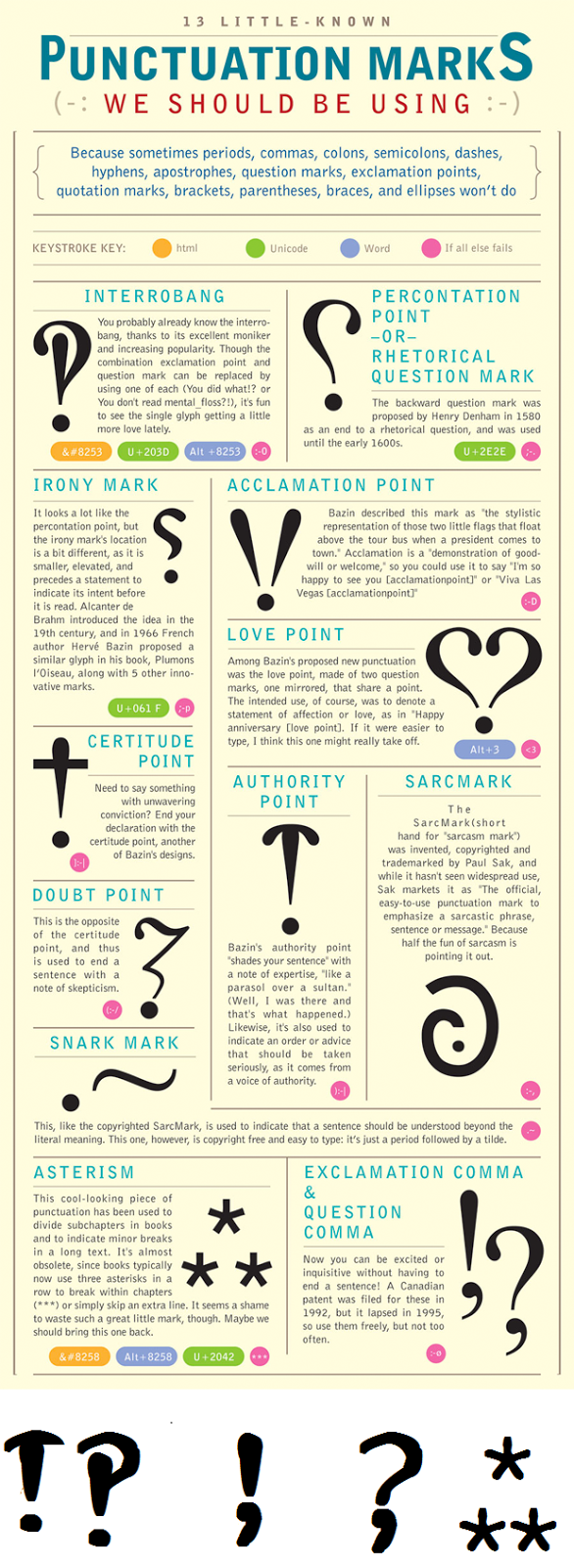
I was surprised to learn recently that I apparently don’t know everything. In the early ’60s, there was a valiant attempt to introduce a newly invented character into mainstream typesetting and I had never heard about it.

This character combines the exclamation point and questions mark into one convenient package. No more having to type out multiple characters to convey your questioning surprise.
Alas, even though this new character made onto the keyboard of Remington typewriters, and has its own Unicode, it did not persist into modern typesetting.
Listen/read all about it here:

99% Invisible Podcast
In honor of National Punctuation Day earlier this week, I propose we revive the interrobang. Who’s with me‽
Here are some additional little-known punctuation marks to use in everyday texting:
The NWSL season starts soon! This seems like a good way to celebrate. Check out the time-lapse video showing the process

Interesting article on the wheelchair icon

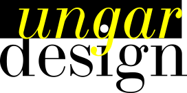
Eye-catching interaction of type and art, not to mention the letterforms of the typeface. The "S" is particularly beautiful.

Some gorgeous prints that I could look at all day. Retro styling with modern touches.

Mural at Sammich on E. Burnside.
Image: Benjamin Tepler

I currently have this image by Matteo Berton as my desktop wallpaper and get comments all the time about it.

I like the faux misregistration and the retro color palette.
